As the former Head of Global Guarantees at ANZ Bank, Charles Wong imagined a solution to small business debt in which accountability could reshape business transactions—where social contract was at the core of B2B engagement.
The challenge
Develop a brand and UX strategy for a SaaS platform revolutionizing B2B debt management by automating and incentivizing on-time payments while overcoming the challenges of the 2020 pandemic lockdowns.
outcomes at a glance
Drove an 18x increase in monthly recurring revenue within 24 months (76x in 36 months) by executing a brand overhaul that included renaming, trademarking, rebranding, market-aligned messaging, and consistent user experiences across touchpoints.
Led end-to-end product lifecycle, leveraging market research, personas, customer journey maps and user feedback to shape the product roadmap and feature roll-out, driving 116% revenue growth from Year 1 to Year 3 post-relaunch.
Achieved a 100% UX satisfaction rating among MVP users, a subsequent 78% increase in customer satisfaction after the re-launch and a 4.9-star rating with Xero users.
Applied agile methodologies across multi-time zoned, cross-functional teams, leading to a 40% reduction in idle time and a 7-week faster time to market.
Received 2022 Xero Accounting nomination for 'Financial Services App of the Year'
Full case study below
Background
Small businesses make up over 97% of Australia's economy but face the challenge of unpaid invoices, with 42.2% owed by the due date locally and 56.2% globally. To tackle this pressing issue, the financial services startup Zelo Pay was born.
At the outset of my engagement, Zelo Pay had a functional platform with built-in automation and accounting services but struggled to gain traction. By trying to address multiple pain points simultaneously, the startup lost sight of its core value—facilitating automated, on-time payments and reducing administrative burdens. Charles enlisted MDMD, a venture strategy consultancy, to help relaunch the financial platform. In my role as the Director of Brand and User Experience, I occasionally provide embedded services, acting as a senior member of a venture’s UX team.
My role
As the senior UX designer and brand strategist, I led a five-person team across multiple time zones to realign messaging, product features, and user experience with customer needs within 13 weeks.
Respecting the company’s history and the work it had accomplished, I encouraged the team to view the existing product as one of many prototypes for evaluation. This reframing shifted our perspective from scarcity—perceived failure in gaining traction—to abundance—the potential for valuable insights.
I initiated a human-centered design process and began our engagement with stakeholder research to better understand user painpoints and identify “first-horizon” customers. I recruited vendors, bookkeepers, accountants, and small business owners to participate in interviews and surveys. Initial research identified small business owners with annual sales under $2M as the initial target audience for several reasons:
Cash Flow Challenges: Smaller businesses often face tighter cash flow constraints, making it crucial to manage receivables efficiently and encourage early payments.
Limited Financial Infrastructure: These businesses may lack access to sophisticated accounting tools or financial departments, increasing their need for automated solutions that simplify invoicing, payment tracking, and collections.
High Impact of Unpaid Invoices: Delayed payments can have a significant impact on small businesses, making tools that incentivize early payments highly valuable.
Based on research analysis, a set of personas was created to empathize with customer needs, align product decisions, and create tailored experiences that resonate with real users. Personas were inspired by those who had participated in our research, including a local cafe owner ($400K annually), a boutique retailer ($800K annually), and a luxury travel agent ($1.4M annually).
user insights
“The design is light and accessible, but it isn’t supporting or reinforcing the value the application is adding.” — Testing Participant
Guided by the personas, I identified participants for usability testing, instructing them to complete tasks from specific prompts and to provide feedback on both their experience and impressions of the design. Across the board, users struggled to identify interface prompts or expected them where none existed. While most found the design visually appealing, they raised concerns that its simplicity might indicate limited data collection abilities. Usability testing revealed several challenges:
Ambiguous prompts: Users struggled to understand or anticipate actions due to unclear or missing cues.
Inconsistent interface elements: Minor differences in language, layout, and design led to user confusion.
Financial literacy assumptions: Some users lacked financial literacy, making it difficult for them to understand certain terminology or the importance of key workflow tasks.
rebrand
“We agreed that Zelo Pay needed a name and brand that more accurately represented the social contract we sought to establish between businesses.” — Charles Wong
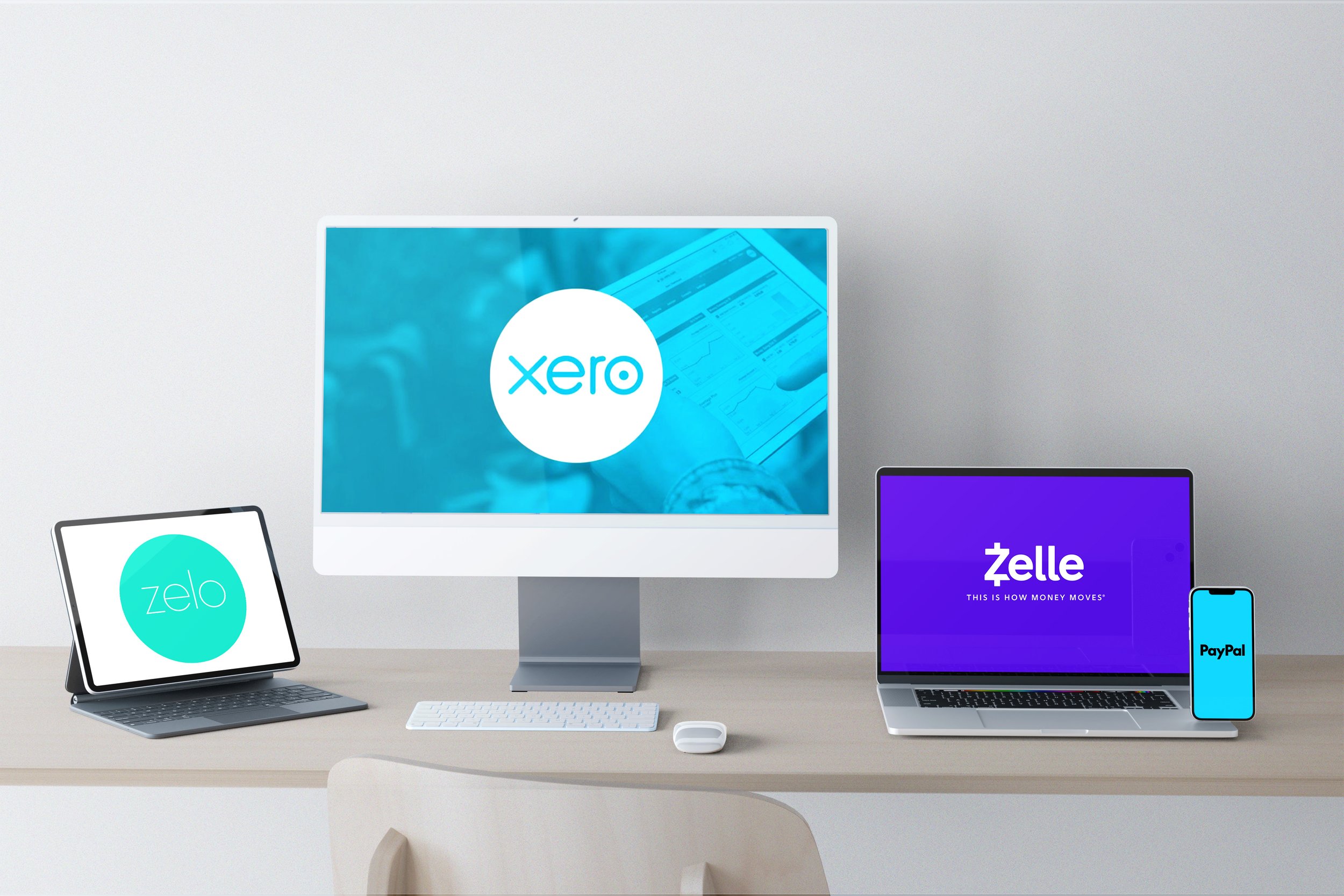
User testing revealed concerns beyond platform functionality, highlighting hesitation toward the brand identity and name. Participants found the bright colors too trendy and playful, giving the impression that the brand lacked seriousness. Additionally, the word "Pay" in the name misled users into thinking Zelo Pay was only a payment platform. The name and visual similarities to their integration partner, Xero, caused confusion and raised concerns about potential infringement. U.S. participants also confused Zelo with the payment services Zelle and PayPal, further complicating brand perception across markets.
Naming process
The naming process is a collaborative and strategic effort, ensuring the brand aligns with both business goals and market positioning. I involve clients early to align on non-negotiables—such as securing an available .com domain—and define essential themes based on the product offering. Working alongside a copywriter, I follow a structured framework, which leads to the development of words across literal, playful, and abstract spectrums, paired with initial taglines to explore narrative potential.
Once we generate a batch of names, I present options to the client, filtering the top choices through trademark checks and language parameters. Additional iterations are often needed to refine the direction. For Zelo Pay, we developed eight themes and brainstormed over 4,000 names. The team was drawn to ideas of flight, financial freedom, and the phrase "early bird gets the worm." Researching bird species connected to target markets (Australia, New Zealand, the UK, and the USA), we narrowed the options to Pipit and Parakeet. The process took three weeks, with the team landing on the name Parakeet, encapsulating the brand's aspirational narrative of agility and opportunity.
Design
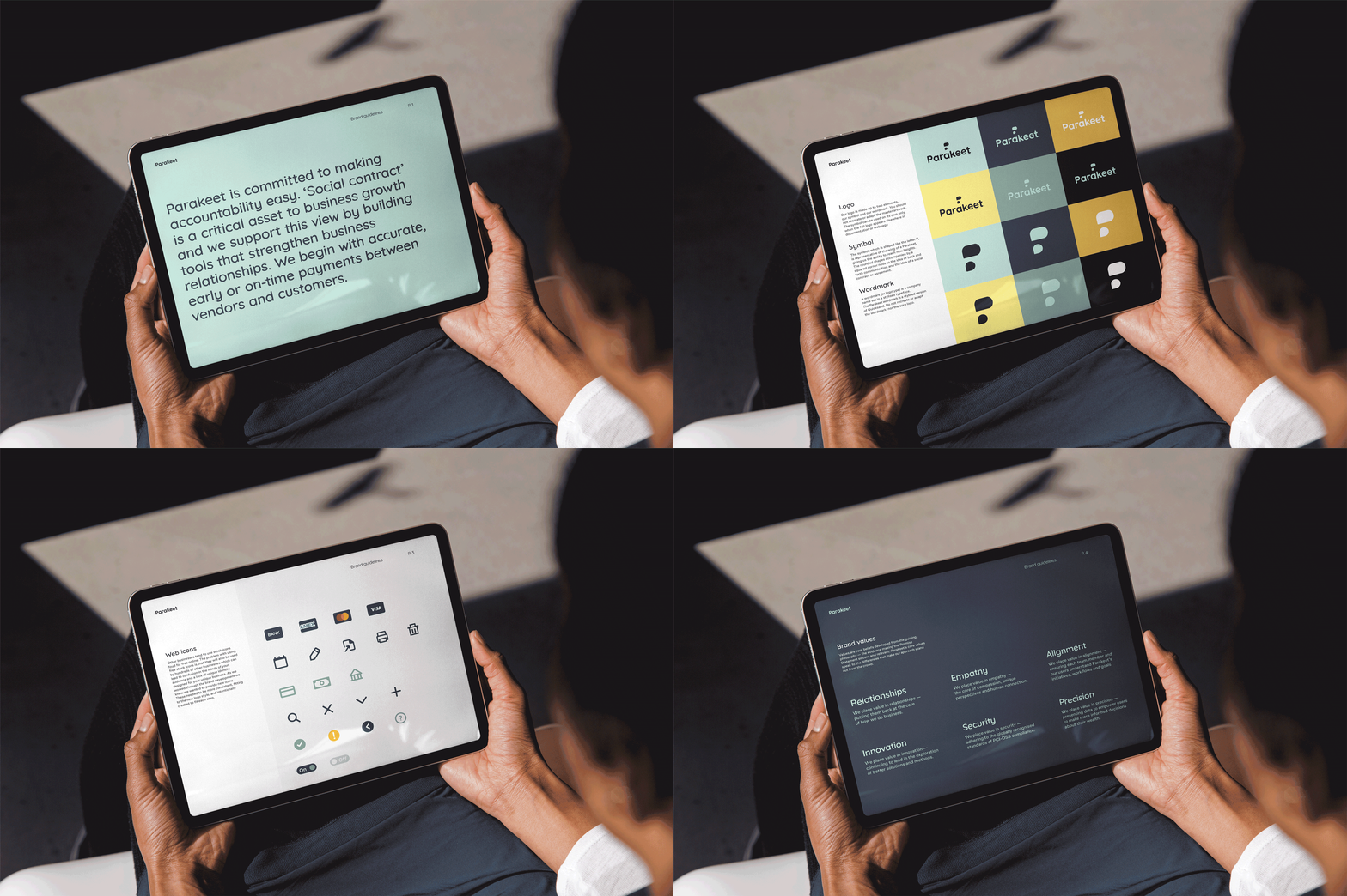
For the brand identity, I drew inspiration from the parakeet’s form and vibrant colors. My goal was to create a symbol that not only represented the letter "P" but also evoked the shape of a plume or feather, reinforcing the brand’s namesake. The final symbol offered the added benefit of resembling speech bubbles, emphasizing communication and the concept of social contracts between vendors and suppliers. To complement the symbol, I customized an existing font for the wordmark, focusing on rounded forms to create a unified, cohesive logo.
uX / UI Design
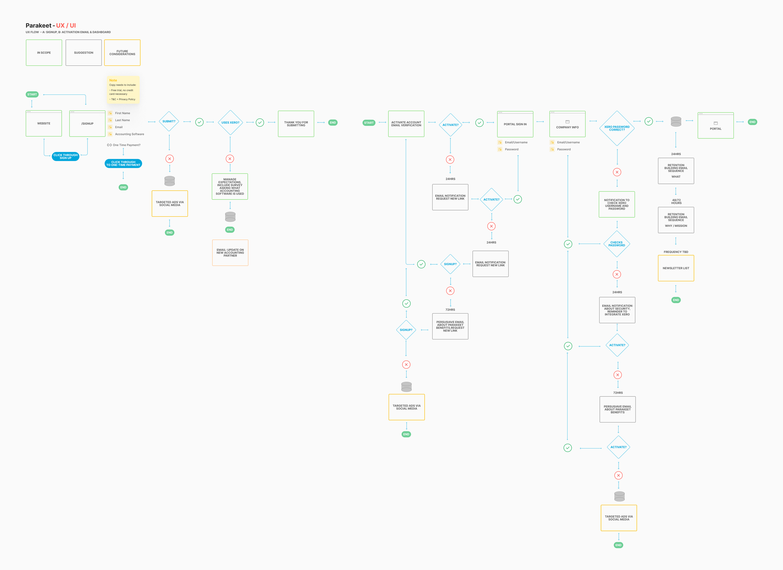
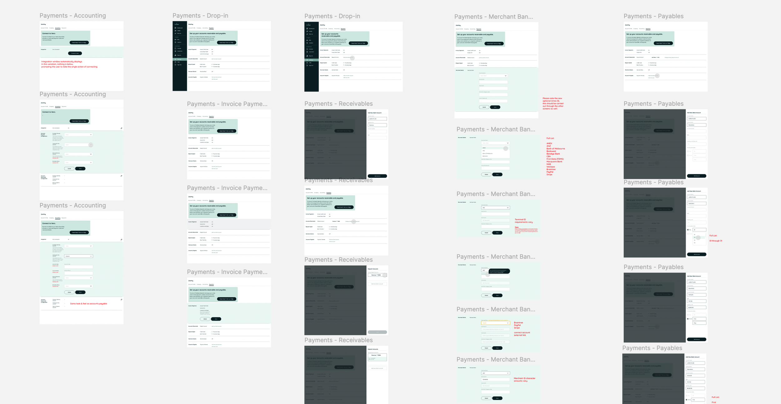
I mapped customer journeys from awareness to acquisition and post-purchase to referral, allowing us to prioritize product feature development—specifically focusing on accounts receivable. This process enabled me to establish an agile workflow and implement weekly design sprints to ensure rapid iteration.
Our journey map provides a detailed view of customer behavior from initial awareness through retention. Features highlighted in pink represent those with the highest return on investment (ROI) and were prioritized for rollout accordingly.
We addressed the following:
Ambiguous Prompts:
Refined prompt wording to be clear, actionable, and aligned with user expectations
Introduced contextual guidance, such as tooltips or progress indicators, to help users anticipate the next steps.
Interface Consistency:
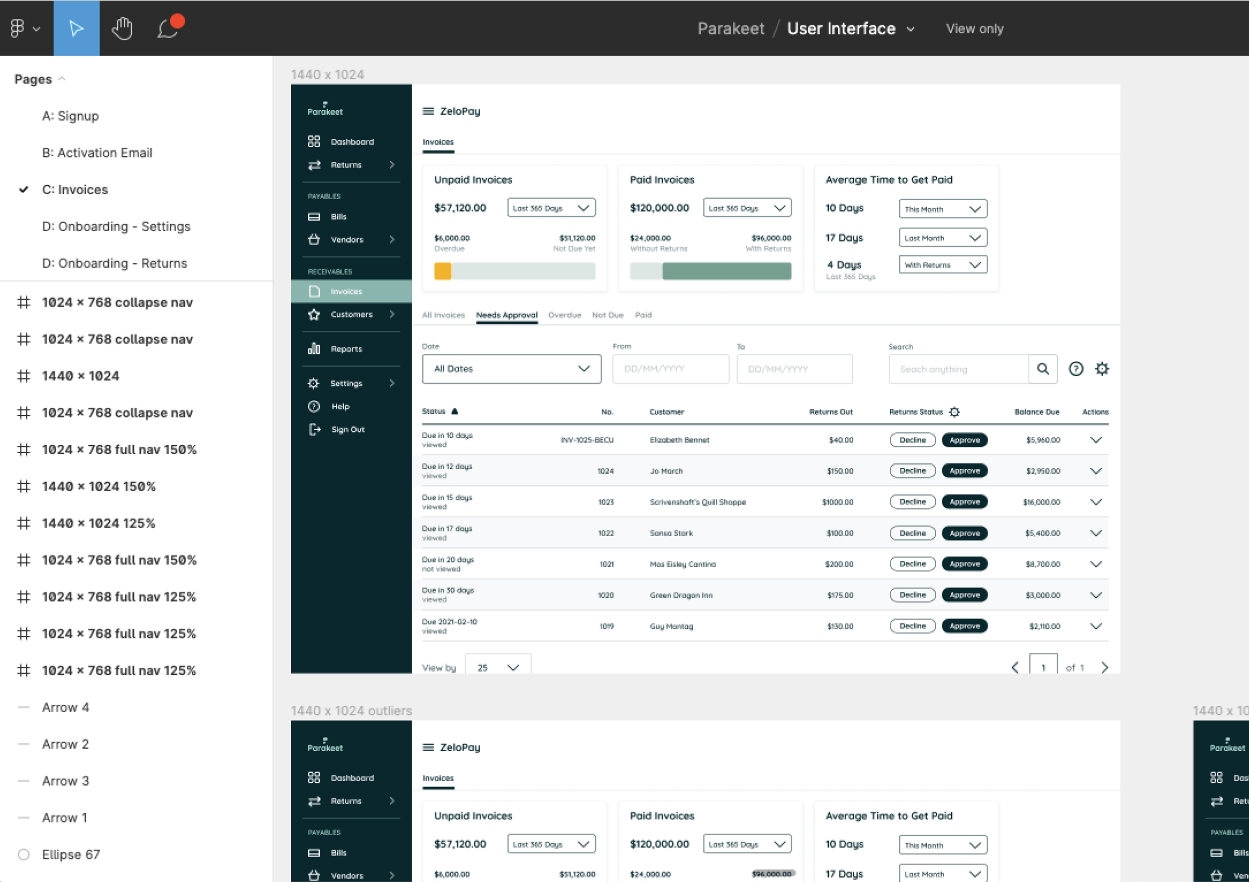
Standardized language, layout, and design elements across the platform to maintain clarity and reduce cognitive load.
Developed and enforced a style guide for UI components to ensure uniformity.
Enhanced Financial Literacy Support
Provided in-app educational resources to explain financial terms and processes.
Implemented user-specific onboarding or task recommendations based on financial proficiency.
product management
I leveraged our different time zones for strategic advantage. For example, a 10 a.m. client meeting on Tuesday in Melbourne allowed me to brief the Seattle-based design team on Monday evening. This setup gave us an uninterrupted day to work on designs while Australia slept, enabling us to deliver several iterations by Melbourne’s Wednesday morning. This workflow reduced idle time by approximately 40%.
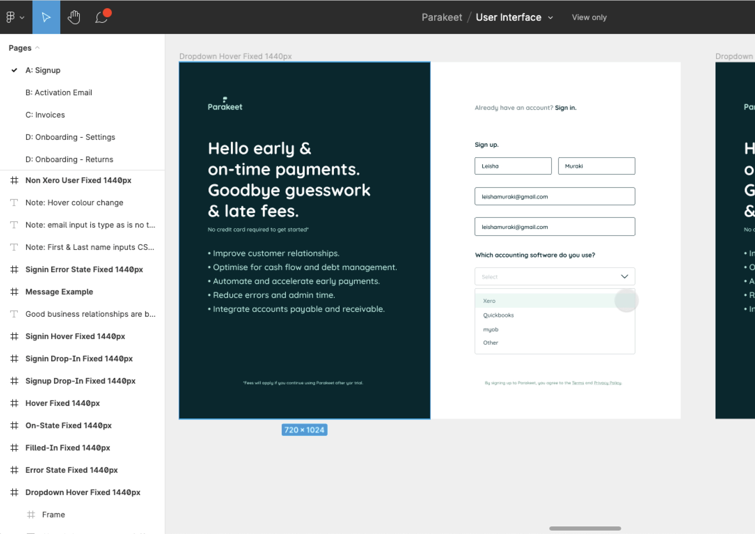
UI work began on November 23, 2020, with each week dedicated to a design sprint, culminating in the completion of the design on January 13, 2021.
The entire process—from initial wireframes and user flows to high-fidelity prototypes and final designs—was completed in seven weeks, all while managing the challenges of pandemic lockdowns and year-end holidays. An additional three weeks were dedicated to product development and launch.
results


